when I conceived the idea for mdesign, it was clear that branding would play a large role in the early success of the organization.

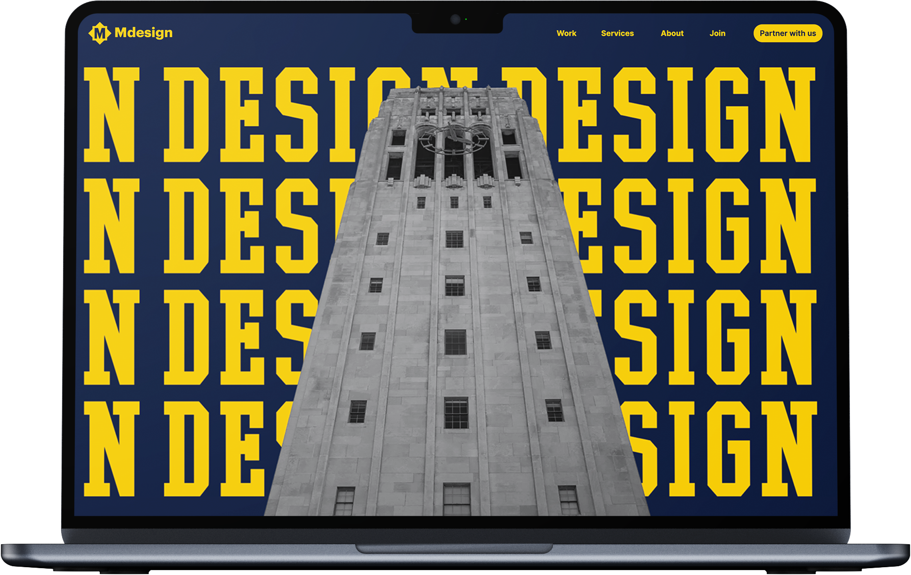
it started with a mark. I wanted the logo to evoke something familiar within the university while standing on its own. I also had to avoid violating trademark laws.

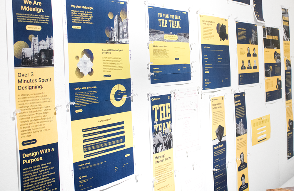
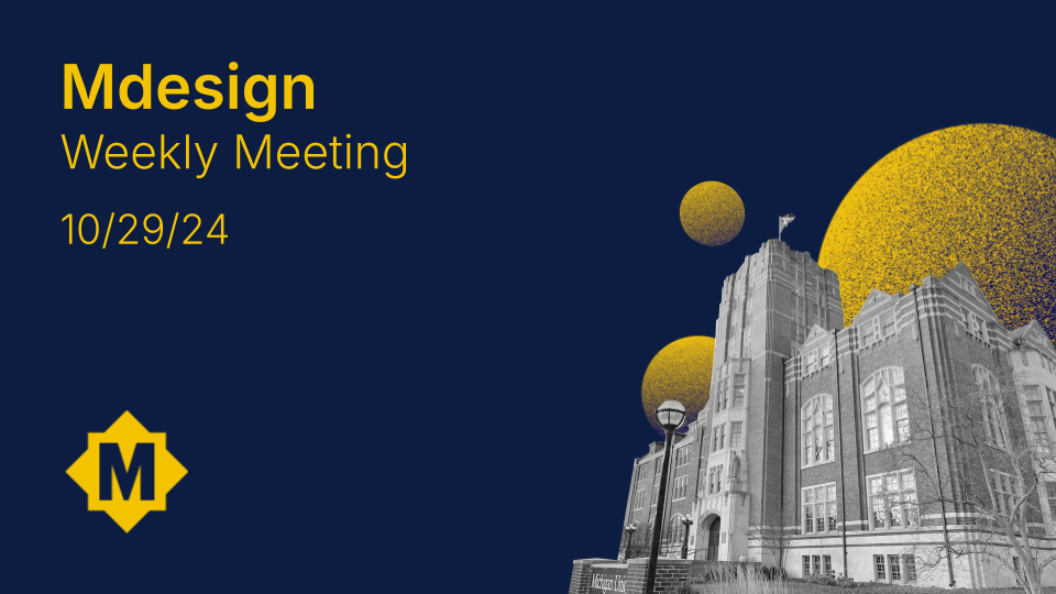
building around the mark and colors, other themes emerged. i chose a clean sans serif font, black-and-white images that contrasted with the maize and blue, and textured circles to add visual interest.
the website was perhaps the most important element as it would be responsible for selling mdesign to the two groups of people that make it work: the clients and the members. the goal was to make the elements i had dynamic and interactive.